Hick's Law
SpaceX
spacex.com
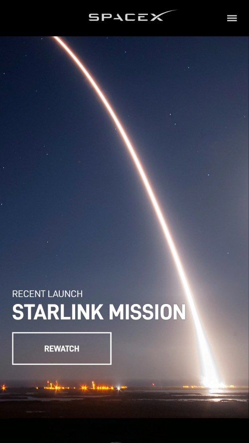
The design principle of Hick's law is exemplified on this page by the website's use of minimal content vying for your attention. The website only has one image at a time as you scroll down, which takes up the entire portion of your mobile screen. That image has one link that you can click on to learn more. They showcase the things they want you to see, and keep it minimal.
White Space/Clean Design
Sony Playstation
playstation.com
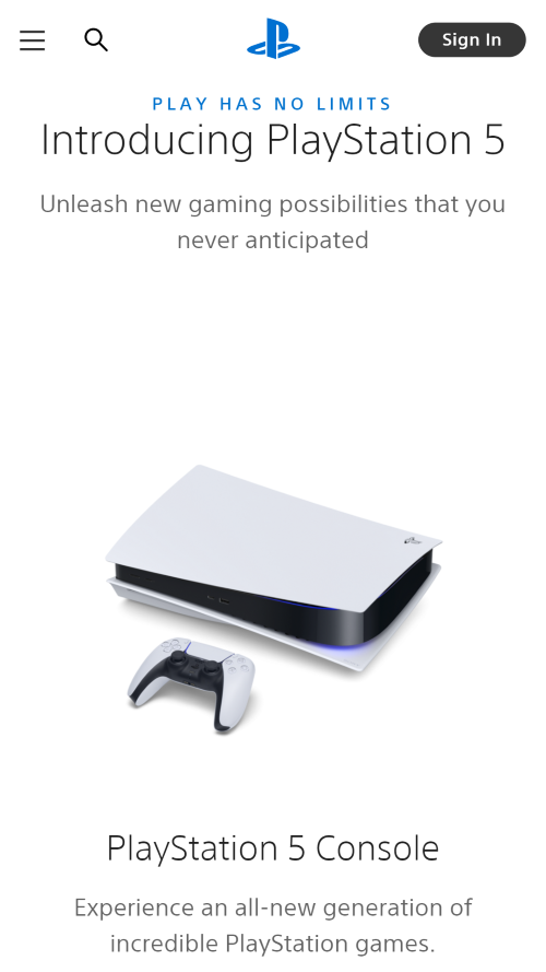
The design principles of white space and clean design is exemplified on this page by the website's use of minimal colors and decent spacing between text and image. Nothing feels claustrophobic and with the lack of many uses of color, the site feels clean and tidy. Also, considering that the product they are showcasing is also white and black, their use of white space and black text help to compliment the image on their site.
Contrast
Zillow
zillow.com

The design principle of Contrast is exemplified on this page by the website's use of light-colored text against a darker-colored background and vice-versa. The website's use of contrast also helps to keep it's information organized as your eyes naturally scroll down the page. From a design standpoint, the contrast also works for this website as the company name and mission statement at the top of the page are written in white text against a blue sky color. This white text can be viewed as mimicking the clouds in the sky above the image.